
TLDR
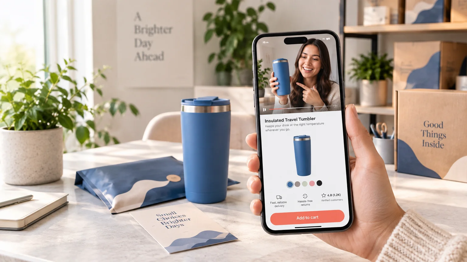
TikTok traffic product page conversion improves when the product page feels like the next scene in the video, not a separate sales experience. Match the creative’s product, variant, benefit, proof, offer, and delivery claim. Then make the mobile page fast, show buying details early, remove variant ambiguity, and measure the journey from a successfully loaded page through purchase. Do not assume every TikTok visitor has a short attention span; assume they will notice friction quickly because the creative has already established a specific expectation.
A TikTok video can earn attention and still send shoppers into a conversion dead end. The video demonstrates one color, promises a starter bundle, answers a practical problem, and creates momentum. The destination then opens with a generic lifestyle banner, an unexplained price, six variant menus, and no delivery estimate. The shopper has to reconstruct the pitch before buying.
The fix is not automatically a larger discount or a louder add-to-cart button. Treat the creative, product page, cart, checkout, and fulfillment promise as one continuous path. Every step should confirm what the shopper saw and reduce the effort required to make a confident decision.
Start TikTok traffic product page conversion with message match
TikTok’s website advertising guidance recommends pairing a campaign with a focused landing page, a clear message, and fewer distractions. For an operator, that means the page should continue the exact commercial argument that earned the click.
Review the opening seconds, spoken claims, captions, comments, call to action, and destination together. If the video centers on a compact travel kit, the page should not make the visitor search a broad collection for the featured items. If a creator demonstrates a specific shade or pack size, preselect it when doing so is accurate and technically reliable, or make it unmistakably easy to select.
| What the TikTok creative establishes | What the destination should confirm |
|---|---|
| Problem | Repeat the same use case in the product title, benefit line, or opening visual. |
| Featured product or variant | Show the demonstrated item prominently and identify its color, size, scent, or pack. |
| Offer | Display the same price, bundle, gift, threshold, or eligibility terms without requiring a search. |
| Proof | Continue the demonstration with product-specific media, reviews, specifications, or instructions. |
| Delivery claim | Show the applicable processing, shipping, geographic, and cutoff conditions. |
| Call to action | Send the visitor to the next logical action rather than a generic homepage or unrelated collection. |
Message match also protects traffic quality. A click won with an exaggerated hook can produce impressive top-line engagement while attracting people who do not want the product at its real price or under its actual terms. Judge the creative by qualified visits and purchases, not clicks alone.
Build the first mobile viewport around recognition
The first screen does not need to contain every answer. It needs to establish that the visitor is in the right place and make the next action obvious. On a typical product page, prioritize a fast primary visual, a concise benefit-led product name, price or offer context, a proof cue, clear selection controls, an early delivery signal, and a visible route to add to cart.
Do not bury the product under a large announcement stack, intrusive sign-up modal, autoplay asset, or generic brand story. Those elements may have value elsewhere, but they should not delay recognition of the item that produced the click.
Speed is part of that recognition. Google defines Largest Contentful Paint as the point when the largest visible content element renders and recommends an LCP of 2.5 seconds or less at the 75th percentile of page loads. Use the official Largest Contentful Paint guidance to assess the metric rather than judging page speed on one office phone and Wi-Fi connection.
Compress and correctly size the hero asset, reserve image dimensions to reduce layout movement, remove unnecessary third-party scripts, and avoid loading a full catalog of media before the primary product content. Measure real mobile traffic by page template and device conditions. A page can feel fast on a recent phone while struggling for customers on slower hardware or networks.
Remove the four biggest buying ambiguities
1. Make variants understandable before selection
Color, size, pack, scent, material, subscription, and personalization controls should use customer language. Show which option is selected, how it changes the price, whether it is available, and what arrives in the order. A thumbnail labeled “Sunset Red” is more useful than an unexplained code. A bundle selector should state quantities rather than relying on “small,” “medium,” and “large.”
Avoid silently changing the hero image, price, subscription status, or delivery date when a shopper taps a control. Make the consequence visible near the selection. For size-sensitive products, put the size guide beside the selector and write it for mobile scanning.
2. Put shipping and returns near the decision
A shopper should not have to add the item to a cart merely to discover whether it can arrive in time. Show realistic processing and delivery expectations, the shipping-cost rule or calculator, geographic restrictions, and a concise returns summary near the buying area. Link to the complete policy for exceptions.
Baymard reports that 64% of users in its research looked for shipping information on product pages, while 43% of the researched sites did not provide it there. The exact percentages should not be treated as a universal forecast for every store, but they reinforce the operational point: delivery is part of the product decision. Baymard’s broader mobile ecommerce usability research also covers product variations, descriptions, shipping and returns information, and reviews.
3. Use proof that resolves a specific doubt
Generic praise such as “Love it!” adds little when the shopper is wondering whether the product fits, matches the displayed color, survives regular use, or requires assembly. Organize reviews and creator assets around buying questions.
- Show the product at a useful scale or in a recognizable environment.
- Include close-ups that reveal texture, finish, seams, controls, or included parts.
- Surface reviews mentioning fit, color accuracy, setup, durability, comfort, or the relevant use case.
- Label paid, gifted, or creator material as required rather than making it look like an ordinary customer review.
- Use captions or transcripts so the proof does not depend on sound.
- Answer repeated TikTok comment questions directly on the product page.
The strongest creator clip is not always the one with the most views. On a product page, a lower-production demonstration that answers a purchase objection can be more useful than a broad awareness video.
4. Explain the offer without creating a puzzle
Offer design is a clarity problem before it is a discount problem. Bundles, quantity breaks, starter kits, gifts, shipping thresholds, and subscriptions can increase order value when they fit the product and the creative. They can also introduce hesitation when conditions appear late or require mental arithmetic.
State what the shopper receives, the total price, any genuine per-unit comparison, and the conditions. Use subscriptions only when replenishment behavior makes sense, and never preselect one in a way that conceals recurring billing. If a creator code is part of the campaign, combine it with tracked links and defined attribution rules; a redeemed code does not necessarily prove which touchpoint caused the sale. See how creator codes and tracked links work together for the attribution tradeoffs.
Diagnose the first meaningful funnel break
Do not collapse clicks, loaded pages, and product views into one number. TikTok defines a Landing Page View as a destination-page view after an ad click when the page successfully loads. It distinguishes that metric from advertiser-configured website events such as ViewContent or Page View. A wide click-to-Landing-Page-View gap may therefore point toward load failure or accidental and low-intent clicks rather than persuasive copy alone.
| Funnel transition | What a large drop may indicate | First checks |
|---|---|---|
| Ad click to Landing Page View | Slow or failed loading, accidental clicks, or destination issues | Test the final URL, redirects, mobile performance, geography, and campaign breakdowns. |
| Landing Page View to ViewContent | Event implementation problems or a mismatch between measurement definitions | Confirm firing rules, consent behavior, event names, and page templates. |
| ViewContent to AddToCart | Weak message match, unclear value, poor proof, variant friction, or unexpected pricing | Replay the creative-to-page journey and watch mobile sessions or usability tests. |
| AddToCart to checkout start | Shipping surprises, cart distractions, code hunting, or technical errors | Test cart rules, shipping visibility, discount behavior, and express-payment options. |
| Checkout start to purchase | Payment failure, delivery restrictions, form friction, trust concerns, or total-cost shock | Break down checkout steps, devices, payment methods, regions, and error logs. |
| Purchase to repeat purchase | Product, service, delivery, or replenishment experience does not support another order | Review support contacts, returns, delivery accuracy, product usage, and cohort retention. |
TikTok recommends tracking the journey from product-page viewing through cart and purchase. Its current website data-connection guidance identifies Pixel plus Events API as a recommended setup and discusses event deduplication. Implementation should be verified against the store platform, consent requirements, and current documentation rather than copied blindly from another account.
Use UTMs or another consistent campaign taxonomy to separate paid ads, organic creator posts, affiliate links, Spark Ads, and other sources. These visitors may arrive with different intent. Do not let an aggregate TikTok channel report hide a strong creator campaign or a weak prospecting audience.
Run a focused 14-day conversion test
A useful test changes one material source of friction and measures the result far enough down the funnel. Avoid redesigning the gallery, offer, reviews, and checkout simultaneously; even if sales move, you will not know what to keep.
- Days 1–2: Identify the product pages receiving the most TikTok visits and replay each journey on mobile from the original creative.
- Days 3–4: Verify final URLs, UTMs, Landing Page Views, product-view events, AddToCart, checkout, purchase, and deduplication behavior.
- Day 5: Find the first meaningful funnel drop and select one plausible cause that the page can address.
- Days 6–7: Build one substantial variation, such as matching the opening visual and headline to the creative, simplifying variant selection, or moving delivery information beside the purchase controls.
- Days 8–13: Run the test across enough representative traffic to avoid reacting to a handful of orders. Monitor errors, inventory changes, campaign mix, and promotion overlap.
- Day 14: Review purchases, conversion rate, order value, discount cost, refunds or cancellations available so far, and contribution quality. Decide whether to keep, revise, or reject the change.
For example, imagine a creator video demonstrating a three-scent discovery kit. The linked page opens on a full-size single product, defaults to a subscription, and hides the kit farther down. The first test should not be a new button color. Send the campaign to the kit, repeat the three-scent framing, show what is included, keep the purchase type explicit, and place delivery expectations beside the selection controls. That test repairs the promise before optimizing decoration.
Make fulfillment complete the promise
Conversion does not end when the payment clears. If the page promises dispatch within a particular window, inventory and fulfillment workflows must support it. An attractive TikTok campaign can amplify operational weaknesses just as quickly as it amplifies a strong product.
After the core product and delivery experience work, packaging can support the next order. A useful insert, package seal, or branded QR sticker from a custom sticker supplier might lead to setup instructions, care information, replenishment, or a related-product page. The destination should help the customer, not merely repeat “follow us.” For more options, review these branded packaging print ideas for ecommerce businesses.
The practical next step is simple: choose the TikTok campaign sending the most qualified traffic, open its destination on a phone, and compare the page with the exact promise in the video. Fix the first point where the shopper must search, wait, interpret, or doubt. Then measure whether that change carries more people to a completed, profitable order.
References
- Website advertising Guide | TikTok for Business
- Largest Contentful Paint (LCP) | Articles | web.dev
- 40+ UX Statistics (from 200,000 hours of UX Research) – Baymard
- Mobile E-Commerce Usability Guidelines – Baymard
- Landing Page View | TikTok Ads Manager
- About TikTok Pixel | TikTok Ads Manager
- Business Resource Center