
TLDR
Matte stickers have a softer, lower-shine look that works well for refined branding, packaging, art, and designs with subtle colors.
Glossy stickers look brighter and more reflective, which makes them a strong choice for bold logos, outdoor stickers, water bottles, laptops, and high-color artwork.
Both finishes can look professional. The better choice depends on the design, surface, lighting, brand style, and how the sticker will be used.
Introduction
Sticker finish changes the way a design feels before anyone reads a word. The same logo can look calm and refined with a matte finish, then bright and punchy with a glossy finish. Neither one is automatically better. They just do different jobs.
That is why the matte vs glossy stickers decision matters. It affects color, glare, texture, photography, packaging, and the way customers understand your brand. A small candle label, a laptop sticker, a brewery logo, and a merch sticker for an artist may all need different finishes, even if they are printed on the same durable vinyl.
The good news is that this is not a hard choice once you know what each finish does. Matte gives you a smooth, understated surface. Gloss gives you shine, contrast, and color pop. Holographic and clear materials add even more options, but most sticker projects still begin with the basic question: matte or gloss?
Here is how to choose the right sticker finish for your design, product, and audience.
What Sticker Finish Actually Means
Sticker finish refers to the outer surface of the sticker. It changes the way light hits the sticker, how the colors appear, and how the sticker feels in the hand.
For most custom vinyl stickers, the finish comes from the laminate placed over the printed design. That laminate does more than change the look. It also helps protect the print from scratches, water, sunlight, and general wear.
A matte laminate has a low-shine surface. It reduces glare and gives the sticker a softer appearance.
A glossy laminate has a shiny, reflective surface. It can make colors look more saturated and high contrast.
If you are ordering custom vinyl stickers, the finish should support both the artwork and the intended use. A sticker is not just a tiny printed image. It is a physical product that has to look right on a real surface.
Matte vs Glossy Stickers: The Main Difference
The simplest way to compare matte vs glossy stickers is this:
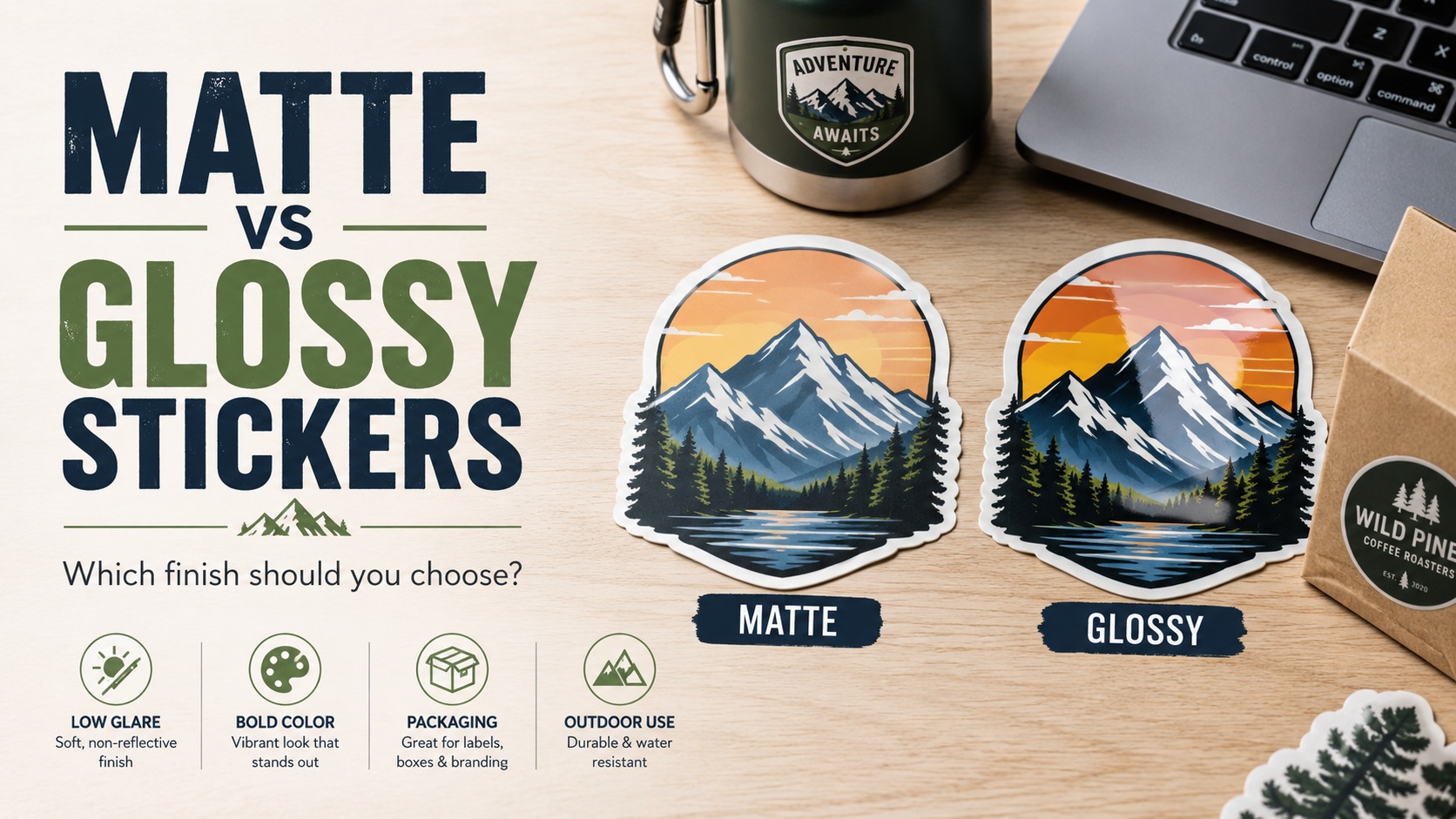
Matte stickers look softer. Glossy stickers look brighter.
That difference affects everything else.
Matte stickers tend to feel more natural, clean, and restrained. They photograph well because they do not reflect as much light. They also work nicely on packaging where you want the brand to feel thoughtful, handmade, modern, or minimal.
Glossy stickers tend to feel more vibrant. They catch light, show color strongly, and often look more classic for promotional stickers, logo decals, water bottle stickers, laptop stickers, and outdoor use.
Here is a quick comparison:
| Finish | Best For | Watch Out For |
|---|---|---|
| Matte | Packaging, art stickers, muted colors, elegant branding, product labels | May make very bright artwork feel slightly softer |
| Glossy | Bold logos, colorful designs, outdoor stickers, water bottles, laptops, giveaways | Can show glare in photos or under strong light |
| Holographic | Magic, music, events, limited drops, bold shapes | Can overpower detailed art if used too heavily |
| Clear | Windows, bottles, minimal logos, transparent effects | Needs strong contrast and clean application |
The right answer depends on what you want the sticker to do.
Choose Matte Stickers for a Softer, More Refined Look
Matte stickers are a strong choice when you want the design to feel polished without being flashy.
They work especially well for:
- candle labels
- soap packaging
- skincare packaging
- coffee bags
- art stickers
- wedding packaging
- boutique branding
- stationery
- muted illustrations
- clean logos
- earthy or minimalist brands
A matte finish lowers glare, which can make it easier to read text in certain lighting. It also tends to photograph well for online shops because the sticker surface does not bounce as much light back into the camera.
This is useful for small business packaging. If you are taking product photos for Etsy, Shopify, or your own website, matte labels and stickers can be easier to shoot without harsh reflections.
Matte also pairs well with softer color palettes. Cream, sage, charcoal, dusty blue, terracotta, blush, olive, and warm neutrals often look good with a matte finish. The sticker feels a little quieter, in a good way.
If your packaging style is clean and understated, matte custom stickers are usually the safer fit.
Choose Glossy Stickers When Color Needs to Stand Out
Glossy stickers are the classic choice for bright, bold, high-impact designs.
They work well for:
- colorful logos
- sports team stickers
- brewery stickers
- band merch
- outdoor brands
- car decals
- laptop stickers
- water bottle stickers
- event giveaways
- cartoon-style art
- bold typography
- high-contrast designs
A gloss finish can make colors feel more vivid. It adds shine and depth, which is useful when the sticker needs to grab attention quickly.
This is why glossy stickers are common for promotional use. If you are handing out stickers at an event, selling merch at a booth, or putting stickers on equipment, the extra shine can help the design stand out.
Glossy stickers also fit designs with sharp contrast. Black and white logos, bright red graphics, neon-style artwork, and saturated illustrations usually look strong with gloss.
If you want that traditional sticker shine, glossy stickers are the obvious place to start.
Match the Finish to the Surface
A sticker does not exist by itself. It sits on something.
That surface should influence your finish choice.
Laptops and Water Bottles
Glossy stickers often look great on laptops and bottles because the finish feels bold and durable. Bright colors stand out, and the shine fits the everyday sticker look people expect.
Matte can also work, especially for cleaner design styles. A matte sticker on a matte water bottle can feel subtle and premium without trying too hard.
Product Packaging
Matte is often a good choice for packaging, especially if the product is handmade, natural, boutique, or giftable. It gives labels and seals a clean look.
Glossy packaging stickers can work well for food, drinks, candy, hot sauce, sports products, or anything with bright branding.
For businesses labeling jars, boxes, bottles, or bags, label and packaging stickers are usually a better fit than general merch stickers because the design can be built around product presentation.
Cars, Coolers, and Outdoor Gear
Glossy is a common pick for outdoor gear because it keeps designs looking sharp and visible. Matte can work too, but the lower shine may look more subtle on rugged surfaces.
If the sticker is going on a truck window, cooler, toolbox, or helmet, think about visibility. The sticker needs to be readable from a few feet away.
Windows and Clear Containers
Clear stickers are their own category. The finish matters, but contrast matters more. White, black, or bold color elements usually work better than pale tones on transparent material.
For glass, bottles, jars, and windows, clear sticker printing can create a clean no-background look. Just make sure the design will still be visible on the final surface.
Think About Lighting and Photography
This is one of those details people forget until the first product photo session gets annoying.
Glossy stickers reflect light. That can look great in person, but it can create glare in photos. If you sell online and photograph every product, that glare can make labels harder to capture.
Matte stickers reduce glare. They often look easier in product photos, especially for packaging, art prints, stationery, and small handmade goods.
That does not mean glossy stickers photograph badly. You just need to control the lighting. Soft natural light, angled positioning, and indirect light can help.
Use this simple rule:
If the sticker will be photographed constantly, matte may save time.
If the sticker needs to look bright in person, gloss may be worth the extra care in photos.
Use Holographic Stickers for Special Drops
Holographic stickers are not just a finish choice. They change the whole personality of the design.
They work best for:
- celestial art
- magic themes
- festival merch
- band stickers
- gaming designs
- fantasy art
- limited edition drops
- bold logos
- simple shapes with open space
Holographic material reflects rainbow colors through parts of the design. That can look great, but it can also compete with detailed artwork. If the design already has a lot going on, the holographic effect may be too much.
The best holographic sticker designs usually leave some areas open so the material can show through. Stars, moons, bold outlines, thick lettering, and simple icons work well.
For limited drops, holographic stickers can help make the product feel different from your standard sticker line without changing the artwork completely.
Sticker Sheets Need a Finish Strategy Too
Sticker sheets are a little different because one sheet may include several designs.
A matte sticker sheet can feel soft, organized, and stationery-friendly. It works well for planners, journaling, classroom stickers, art packs, and themed decorative sets.
A glossy sticker sheet can feel brighter and more playful. It is a strong fit for kids’ stickers, character sheets, product freebies, colorful icons, and event merch.
When designing custom sticker sheets, think about the whole sheet, not only the individual stickers. The finish should match the overall theme. A soft botanical sheet may feel better matte. A bright summer camp sticker sheet may feel better glossy.
Also consider how people will use the stickers. Planner and journal users often like a smoother, less reflective look. Merch buyers may prefer a brighter finish.
When to Use Roll Labels Instead of Individual Stickers
Individual stickers are great for merch, giveaways, laptops, bottles, and branded extras.
Roll labels are better when you are applying the same sticker over and over to products or packaging.
Use roll labels for:
- candles
- jars
- coffee bags
- boxes
- bottles
- bakery packaging
- soap wraps
- shipping bags
- retail products
- event packaging
Roll labels are easier to apply repeatedly because they come on a roll. That makes them more efficient for packaging stations and product runs.
If you are branding products rather than selling stickers as merch, custom labels on rolls may make more sense than a stack of die cut singles.
The finish choice still matters. Matte roll labels feel clean and understated. Glossy roll labels feel bright and retail-ready.
How to Choose the Right Finish for Your Brand
A finish should match the brand personality.
Here is a simple decision guide:
Choose matte if your brand is:
- calm
- handmade
- natural
- minimal
- elegant
- modern
- soft
- earthy
- boutique
- understated
Choose glossy if your brand is:
- bold
- colorful
- energetic
- playful
- sporty
- loud
- event-driven
- outdoorsy
- merch-focused
- promotional
Choose holographic if your brand is:
- creative
- magical
- music-focused
- fantasy-inspired
- youth-oriented
- collectible
- limited-edition friendly
Choose clear if your brand is:
- minimal
- clean
- product-focused
- modern
- glass-friendly
- window-friendly
This is not a strict rule. A natural skincare brand can use glossy labels. A skate brand can use matte black stickers. But these categories help you avoid picking a finish only because it sounds nice.
The finish should support the design.
Design Tips for Matte Stickers
Matte stickers can handle subtle design better than glossy stickers, but they still need enough contrast.
Use matte stickers well by:
- keeping text readable
- using strong linework
- avoiding colors that are too close together
- testing small text at actual size
- leaving enough space around the design
- using clean shapes for die cut edges
Matte finish can make a design feel more refined, but it will not rescue a low-contrast file. If pale gray text sits on a cream background, it may still be hard to read.
For packaging, matte works best when the layout is clean. Let the finish add softness. Do not overload the label with too many fonts, icons, claims, and decorative borders.
Design Tips for Glossy Stickers
Glossy stickers reward bold design.
Use gloss well by:
- choosing strong colors
- using clear outlines
- keeping important text large
- making the shape easy to recognize
- using high contrast
- avoiding too many tiny details
- checking glare if the sticker will be photographed
Glossy finish can make colors pop, but it can also make a cluttered design feel busier. If your artwork has a lot of small elements, make sure the main subject still reads quickly.
Glossy works especially well with white borders on die cut stickers. The border gives the design breathing room and helps it stand out on different surfaces.
Order a Small Batch Before Going Big
The best way to choose between matte and glossy stickers is to test the design.
Screens are not reliable enough for final judgment. A design that looks bright on your monitor may feel different on printed vinyl. A finish that seems right in theory may look different on the actual product surface.
A small test batch can help you check:
- color
- contrast
- finish
- cutline
- size
- readability
- packaging fit
- photography
- customer response
Testing is especially useful if the sticker is part of a larger product line. A candle label, hot sauce label, art sticker, or event giveaway may be used hundreds of times. It is worth seeing the physical version before committing to a large run.
Common Finish Mistakes to Avoid
The most common mistake is choosing a finish without thinking about the use.
A matte sticker may look beautiful on packaging but feel too quiet for a bold giveaway. A glossy sticker may look great in person but be harder to photograph on a reflective jar. A holographic sticker may seem exciting but overpower delicate artwork.
Other common mistakes include:
- using tiny text on small stickers
- ignoring contrast
- forgetting the surface color
- choosing clear material without planning for visibility
- using holographic material on overly detailed designs
- ordering too many before seeing a proof
- assuming screen color will match print exactly
- picking a finish only because another brand used it
Good sticker design is practical. It needs to look good where it will actually live.
Conclusion
Matte vs glossy stickers is not about which finish is better. It is about which finish fits the design, brand, and use.
Choose matte when you want a softer, cleaner, lower-glare look. Choose glossy when you want stronger color, shine, and classic sticker energy. Use holographic for special designs and clear stickers when the surface should show through.
The best sticker finish is the one that helps the design do its job. That might mean standing out on a water bottle, looking refined on a product label, photographing cleanly for an online shop, or making a limited merch drop feel more collectible.
Start with the finish that matches your goal. Then test it in the real world.